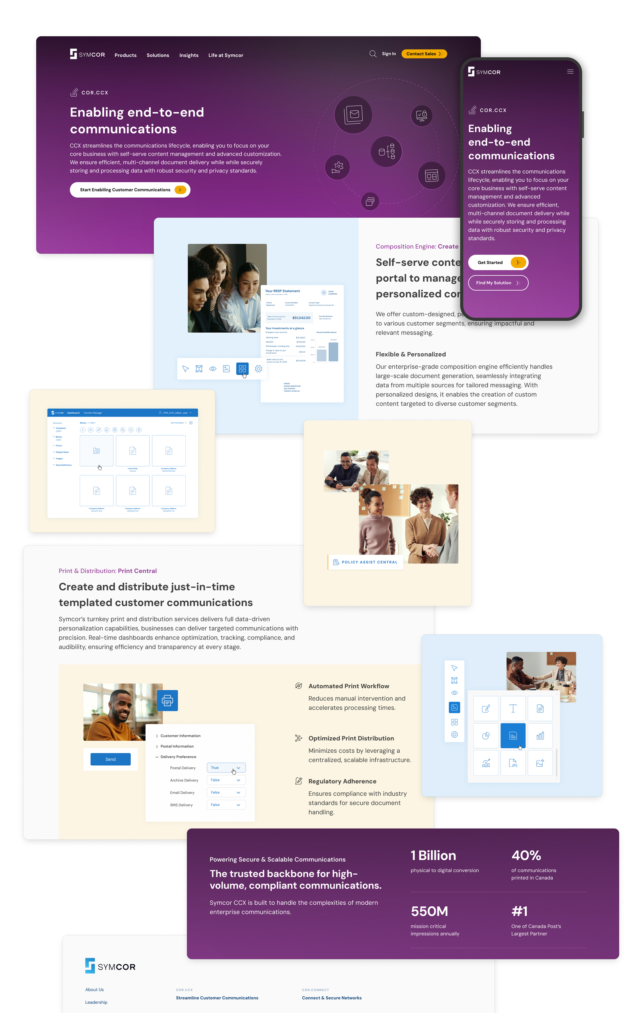
Symcor had evolved beyond what its website communicated, making it difficult for users to discover its capabilities and relevant solutions.
Approach
Industry research and leading digital storytelling practices guided a modernized brand and clearer content experience.
Solution
A redesigned marketing website that elevated the brand, improved solution discovery, and supported customer engagement and growth.
Context
Symcor is a leading Canadian business process outsourcing (BPO) provider delivering payment processing, customer communications, and digital transformation services for major financial institutions, including BMO, TD, Scotiabank, RBC, and 100+ others across Canada.
Symcor’s website had not been redesigned in over a decade...
The Status Quo
A Website Built for Yesterday’s Business Needs
Symcor had evolved beyond what its marketing website communicated. While the organization offered a wide range of trusted solutions for financial institutions, the existing digital experience did not fully showcase its capabilities, guide users toward relevant services, or support broader business opportunities.
The challenge was to create a modern digital experience that elevated Symcor’s brand, improved solution discovery, and transformed the website into a stronger driver for customer engagement and growth.
Distinct Needs, Common Struggles
Getting Closer to the Customer Experience
Symcor’s website served multiple audiences with distinct goals—from prospective clients evaluating solutions, to long-standing customers exploring additional services, and internal sales teams leveraging digital content to support client conversations. Although each audience interacted with the website differently, several common challenges emerged across all user groups:
Shared Pain Points: journey mapping across prospects, clients, and sales representatives revealed a consistent drop in satisfaction during the evaluation phase of the sales process.
Barriers to Self-Service: Users struggled to find relevant information because unclear messaging and product names made it difficult to understand what Symcor offered and which solutions aligned with their needs.
Information Gap: Without a clear connection between user needs and Symcor’s services, prospects and clients often relied on sales representatives to explain basic offerings—creating unnecessary dependency and missed opportunities for self-service.
The Prospect
Role: API Developer for a Fintech
“I just want to understand what they're selling without decoding product names.”
Goals:
Find a secure, compliant data-sharing solution
Self-serve research without needing a sales call
Pain Points:
Can't parse what Symcor sells beneath layers of brand jargon
Doesn't see Fintechs represented in listed industries
Has to piece together his own solution from fragmented content
The Current Client
Role: Banking Operations in Finance
“I was told about a product that could help my team, but I can't find it on the site.”
Goals:
Expand Symcor services across more operational functions
Understand how new offerings complement her existing suite
Pain Points:
Can't navigate from the homepage to the product she needs
Vague messaging makes it unclear how COR.PRO connects to COR.CCX
Cannot understand site terminology
The Strategist
Role: Account Executive at Symcor
“I can't send clients a link that explains the solution. I have to explain it for the site.”
Goals:
Surface relevant offerings based on client challenges
Use the website to support sales conversations
Pain Points:
No clear product pages to share with clients
Limited self-serve content forces sales to compensate for the site
Sales materials carry the weight the website should handle.
Inspired by the Best
Defining the Principles Behind the Redesign
Established UX standards helped define how the redesigned experience should look, feel, and behave. By gathering inspiration from industry patterns, design principles, and conversion best practices, we established a clear foundation for the redesign and aligned with Symcor on the experience principles needed to guide the work. These standards ensured users could navigate, understand, and complete tasks more intuitively with greater clarity and confidence.
Natural Language
Write the way users think and speak, not in internal product names or jargon. Tailor content to what each user is trying to do so it feels relevant and builds trust.
Symcor’s current site leaned heavily on branded terminology that meant nothing to new visitors.
Aesthetic Pleasing Effect
Use clean, intentional aesthetics to improve usability and build confidence in the experience.
Enable Control & Freedom
Guide users through customizable experiences with clear, step-by-step interactions.
Consistency & Standards
Maintain consistency across pages, layouts, and devices.
Flexibility & Efficiency of Use
Prioritize ease of use while providing access to advanced functionality when needed.
Visible & Recognizable
Utilize design structures that align with other applications, so its intuitive for users.
Error Prevention
Prevent errors through thoughtful design rather than relying on recovery after mistakes occur.
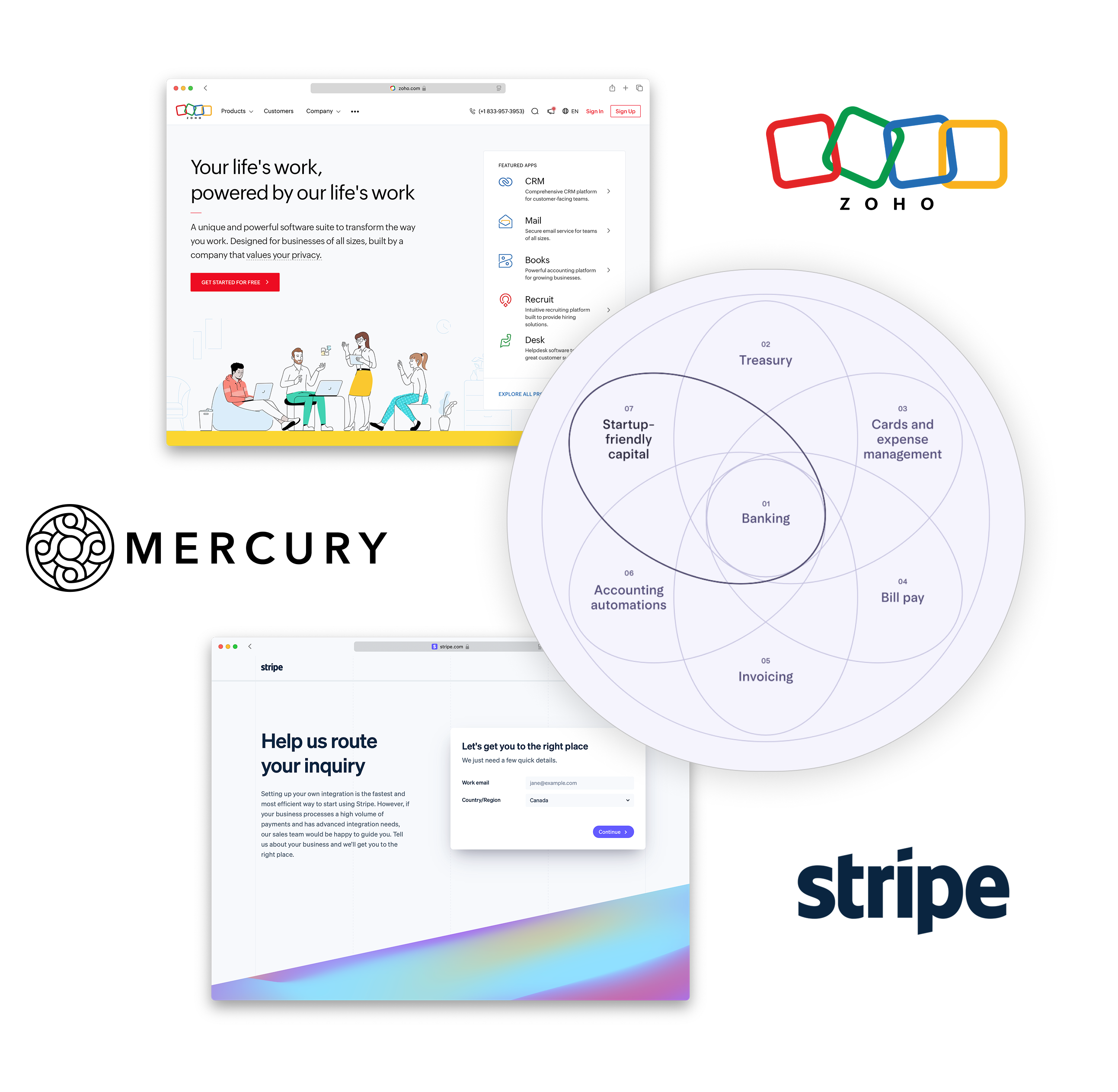
Analyzing the Patterns That Drive Growth
Leading platforms revealed three patterns that consistently separated high-converting experiences from the rest.
Product Discovery – Zoho
Products above the fold, action-oriented language, single, clear CTA. Users engage immediately without hunting.
Cross-Sell and Ecosystem Clarity – Mercury
A full view of the product ecosystem with utility built into the visuals. Exploration and discovery feel like the same action.
Lead Generation – Stripe
Email captured first, details revealed progressively. Users are guided to the right product fit without cognitive overload.
Key Principles Behind Trust and Conversion
Key Takeaways from analyzing platforms with similar product structure:
Lead with Benefits, Not BrandUsers respond to value and relevance, not product names.
Reduce Cognitive LoadLimit text, colour, and options so users can move through the page without friction.
Credibility and AuthenticityBe transparent about how information is used. The less you hide, the more trustworthy you become.
Social ProofTestimonials build trust, but only when they feel genuine.
Setting the Stage
Finding the Right Structure for Symcor’s Story
How Leading Platforms Guide Users Forward
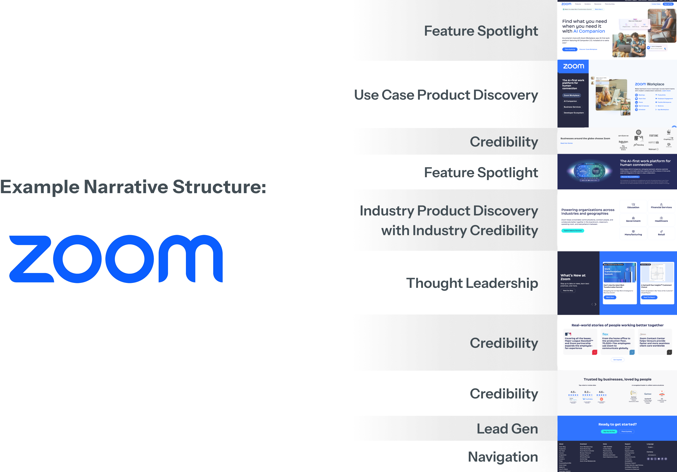
We conducted a UX narrative analysis across multiple websites to understand each site’s content hierarchy, structure, and core objectives. These insights helped inform how we could position Symcor’s product offerings.
Here’s how Zoom structures its website to establish a clear content hierarchy, streamline navigation, and drive users toward primary conversion paths:
Feature Spotlight: Leading with impact
Use Case Product Discovery: Guiding users through use cases
Credibility: Building credibility by displaying customer logos
Lead Gen: Capturing leads at the right moment when trust and credibility have been established
Creating a Progressive Content Experience for Discovery and Conversion
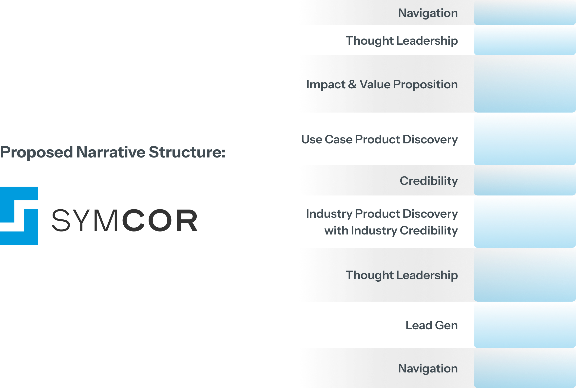
Building on the patterns identified from leading platforms like Zoom, we applied a similar content strategy approach to Symcor’s experience—sequencing information intentionally to help users understand, explore, and take action. Each section was designed to provide the right level of context at the right moment, guiding users forward without overwhelming them.
Benefits:
Value Proposition: Clearly communicate what Symcor does, who it serves, and the value it provides from the start.
Use Case Product Discovery: Connect users with relevant solutions based on the challenges they are looking to solve.
Credibility: Build confidence through industry-specific examples, customer proof points, and relevant success stories.
Lead Generation: Introduce conversion opportunities progressively, capturing interest when users are most engaged and ready to take the next step.
Evaluating the Right Evolution
Defining the Future Experience: From Familiarity to Transformation
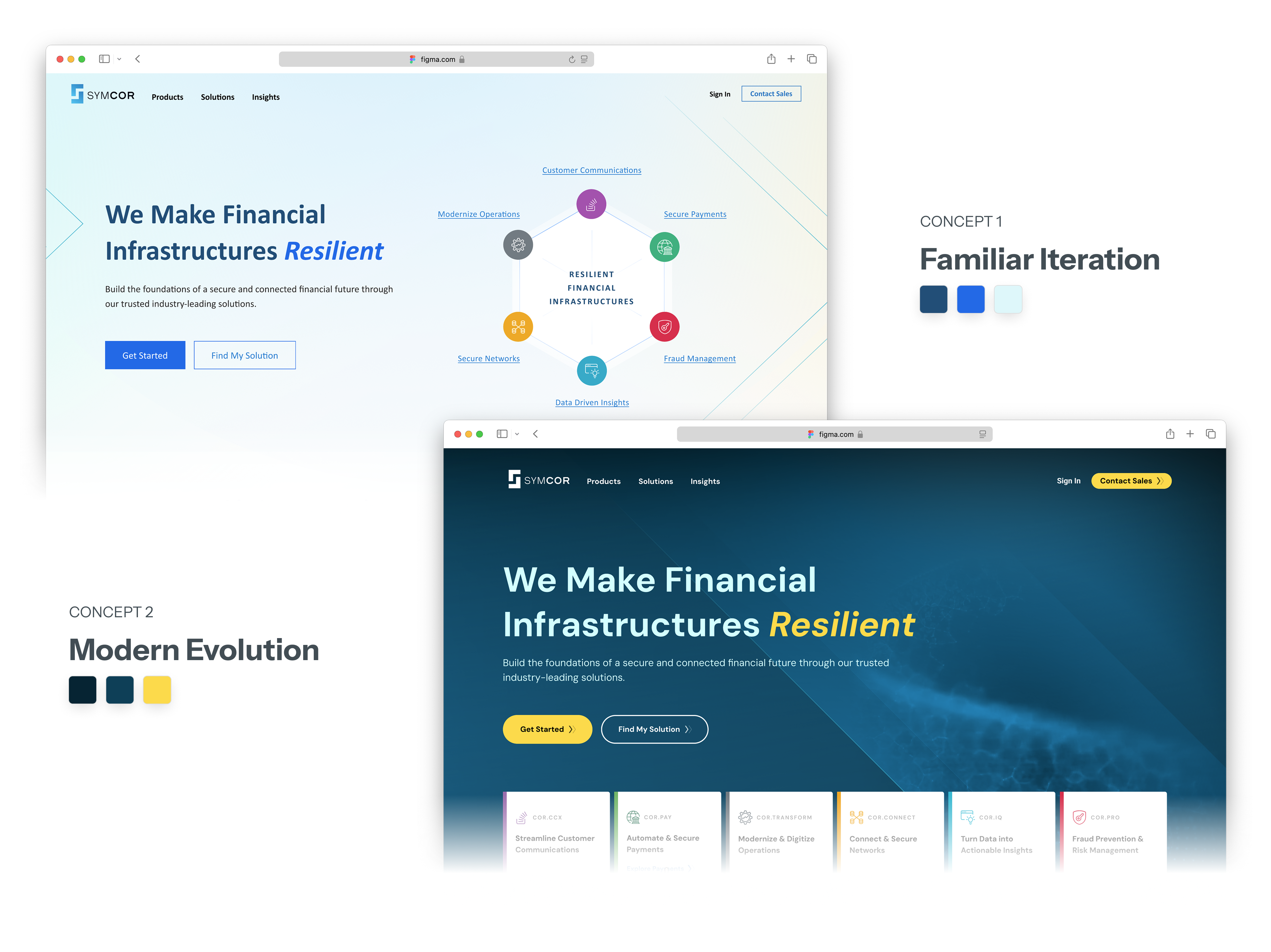
Two concepts were explored—one taking a more conservative approach to redesigning Symcor’s existing digital experience, while the other challenged the boundaries of the current brand to imagine what Symcor could become.
Concept 1: Familiar Iteration
Using font and color familiarity to leverage Symcor’s legacy brand guidelines.
Narrative-driven approach with existing brand guidelines
Find My Solution navigation surfaces relevant content quickly
Balances product details with broader industry challenges
Concept 2: Modern Evolution
Pushing beyond Symcor’s existing color palette and brand guidelines.
Expanded visual language prioritizing usability and accessibility
Cleaner layout and typography for improved readability
A more intuitive structure that reflects where Symcor is headed
Balancing Legacy and Evolution
Challenging Legacy Constraints for Future Growth
After presenting the two design directions to stakeholders, the bold, innovative approach received strong enthusiasm, but concerns emerged around moving beyond Symcor’s existing brand guidelines.
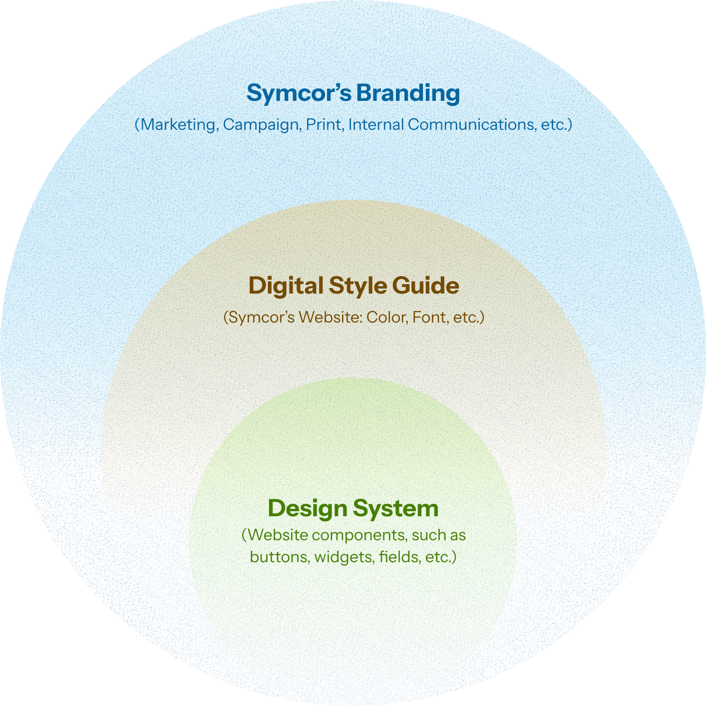
We challenged this hesitation by reframing the opportunity: rather than abandoning the brand, we proposed evolving it for the digital landscape. Symcor’s current guidelines were created primarily for print and marketing, did not account for the needs of modern digital experiences, leaving stakeholders anchored to legacy rules that limited usability, accessibility, and flexibility.
We advocated for expanding the existing brand system into a digital-first style guide and design system—one that preserved Symcor’s brand equity while enabling a more intuitive, engaging, and user-centered experience.
A website cannot simply function as a digital advertisement; it must serve as a tool that helps users understand, navigate, and take action. This shift required moving beyond static brand expression to create a scalable digital foundation built for how users interact today.
Bridging the gap
How might we transform Symcor’s digital brand experience for prospective and existing clients so that we can increase engagement, generate sales leads, and drive business growth?
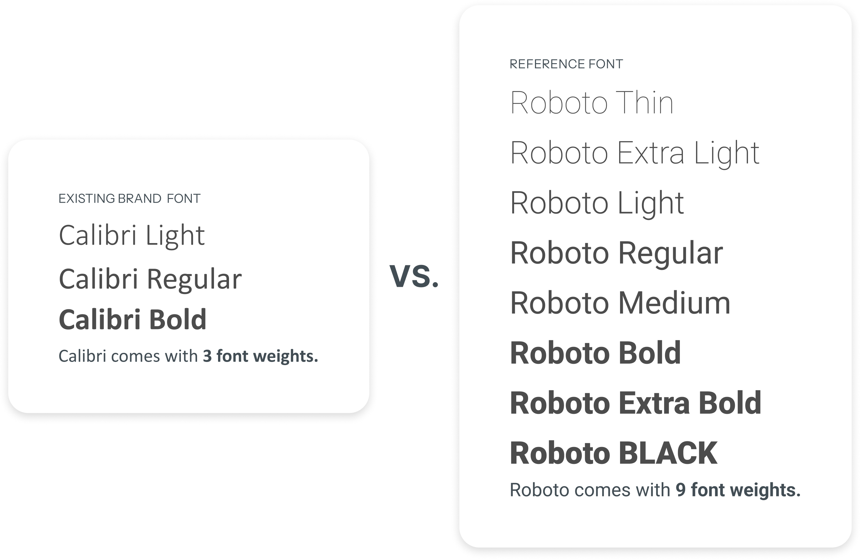
Calibri: Warm and Familiar, But Not Built to Scale
UI fonts should be flexible enough to support headings, body text, labels, and various digital components. A versatile typeface like Google’s Material Design font, Roboto, provides the range of weights needed for a consistent experience.
Calibri had brand affiliation going for it. It was already in use, warm in character, and consistent with Symcor's existing guidelines. But three weights can’t support the hierarchy a digital experience demands.
It didn't communicate progression or forward thinking, and it didn't align visually with the logo and where the brand needed to go.
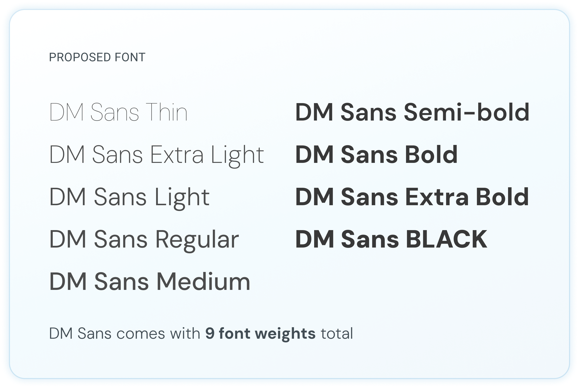
DM Sans: Accessible by Design, Cohesive by Nature
DM Sans was purpose-built for digital.
Ten weights meant every component had the hierarchy it needed.
Clean, modern, and visually cohesive with the Symcor logo, it communicated progression and forward thinking while meeting accessibility standards at every screen size.
From Brand Colors to Digital Expression
Ensuring the digital brand identity is functional, accessible, and easy to use.
Expanding the Palette, Preserving the Brand
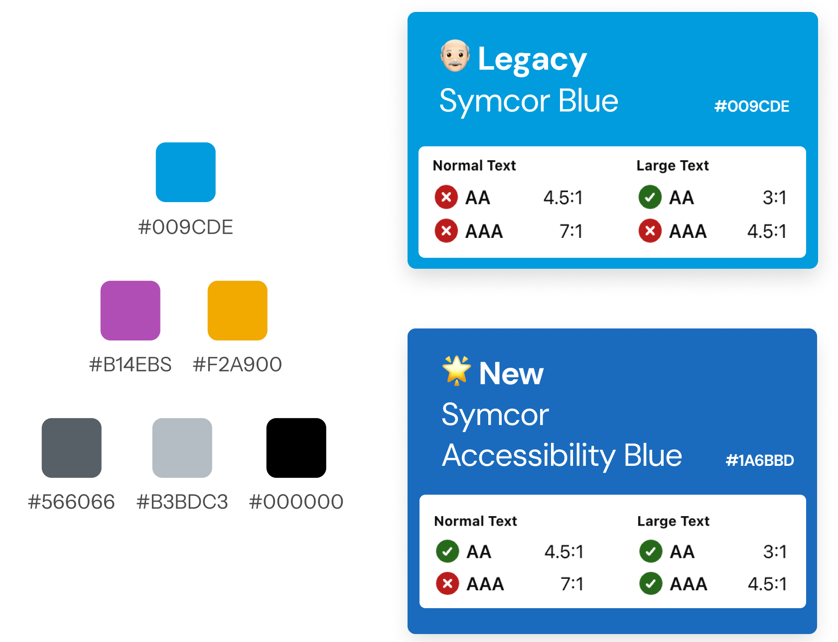
Symcor’s existing colours weren’t built for digital screens.
Poor contrast didn’t pass accessibility standards and created invisible friction for users trying to self-serve.
Following the lead of IBM Carbon and Dropbox, the brand palette was expanded to meet global accessibility standards while keeping the brand intact.
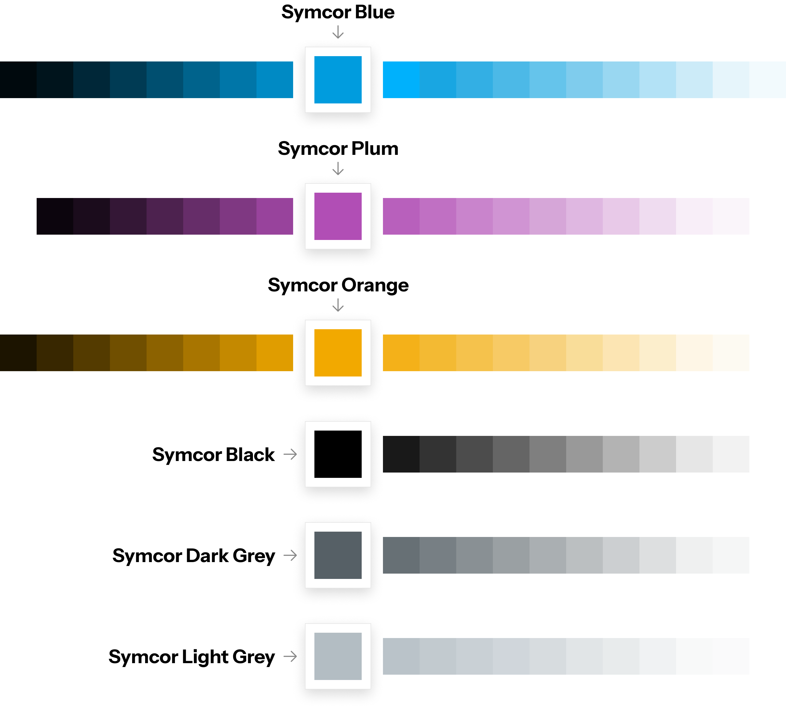
Building a Functional Digital Color System
A digital colour system gives every element a specific job.
Expanding Symcor’s palette into a full range of tints and shades provided clear visual cues for buttons, backgrounds, and interactive states reducing the mental effort needed to navigate for every user type.
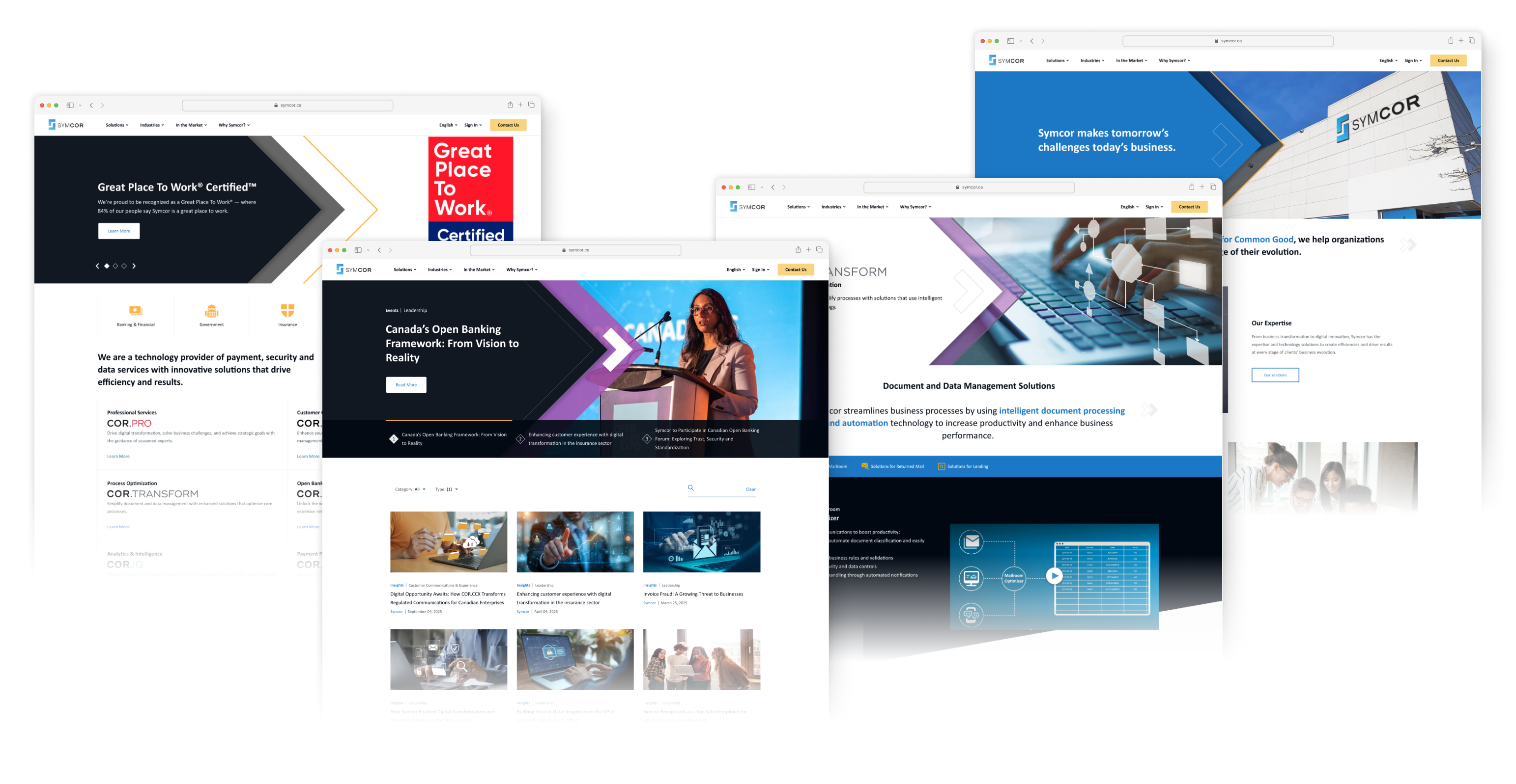
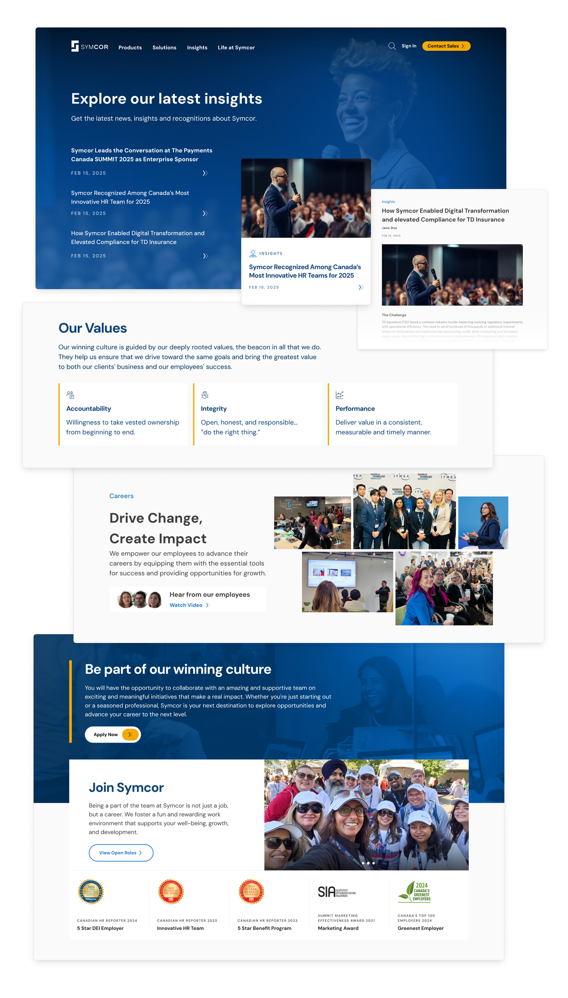
The Transformed Experience: A Refreshed Brand Identity Built for Digital
Colour and typography were updated to meet the demands of a modern web experience.
The Transformed Experience: Built in Modules. Scalable Across Every Page.
Designing with modular components gave the site flexibility to scale across every content type, from product pages and insights to life at Symcor.
Each module was built to work independently and together, ensuring visual consistency without sacrificing relevance for each user type.
The Chosen Experience: Modern Evolution
Symcor implemented the redesign based on the expanded digital brand guidelines and narrative UX framework.
The new site gave prospects a clear entry point, gave existing clients the context they needed to self-serve, and gave Account Executives a tool they could actively use in sales conversations.
The work that started as a resistance to change became the foundation for a more accessible, credible, and conversion-ready experience.