
Hick's Law
Eleven items, no prioritization, no guidance.
The more choices presented, the longer it takes to decide.
B2C UX Consulting
Context
FedEx Corp. operates under one global brand, but each region owns and manages its website independently. This means FedEx Canada needed to manage and solve its own problems while adhering to the same brand standards as FedEx US, UK, and APAC.
In 2025, FedEx Canada prioritized a digital strategy centred on self-service, intent recognition, and reduced support dependency.
The Journey Begins
FedEx Canada partnered with Konrad Design Consulting Agency to investigate challenges within its account login experience, where navigation complexity was contributing to user friction and drop-offs.
Our team first analyzed available data and user behaviour to diagnose where and why users were encountering barriers throughout their journey.
Quantitative Data
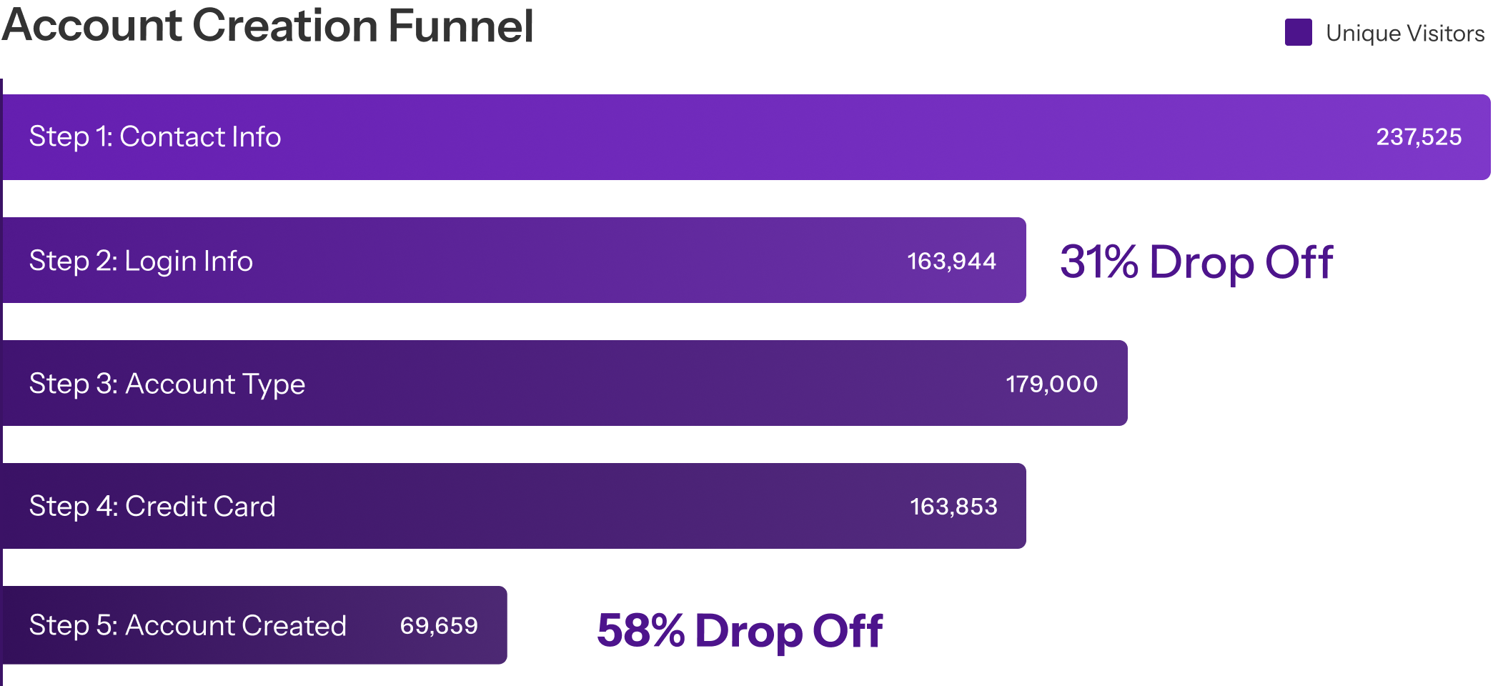
At our request for both qualitative and quantitative inputs, FedEx provided internal research from the JOIN team, including exit survey data that highlighted two primary blockers:
Concern about entering credit card information.Users were hesitant to provide payment details early in a flow they didn’t yet trust.
Low intent to create an account.Many visitors were exploring services that didn’t require account creation or credit card registration.
Qualitative Data
The exit survey showed users were abandoning because they were in the wrong flow entirely.
Most users needed FedEx services that don’t require credit card details.A User ID was all they needed to get started, but the experience was routing them into full shipping account creation which requires credit card details.
Most users opening a FedEx Account described tasks a User ID could handle.They weren’t choosing wrong deliberately. They had no guidance to choose correctly.
The result was low conversion and an experience that eroded trust before it had a chance to build it.

Observing Through the Noise
In a consulting environment, our role is to bridge the gap between stakeholder objectives and user needs. By separating these perspectives, we clarified what the business was trying to achieve versus what users were struggling with, anchoring conversations around real user challenges while aligning with the business outcomes stakeholders were working toward.
To me, there is no better tool than a few strong How Might We statement for creating this alignment.
How might we help FedEx customers navigate to their intended flows precisely in order to expedite their tasks from shipping, receiving and payment?
How might we mitigate FedEx’s customer pain points regards to account login and creation in order to lower drop off rates, increase traffic and increase the number of account activations?
Uncertainty to Direction
While HMW questions helped define the problem space from both the user and business perspectives, hypothesis provided a framework to guide solution exploration and decision-making.

Seeing What the User See
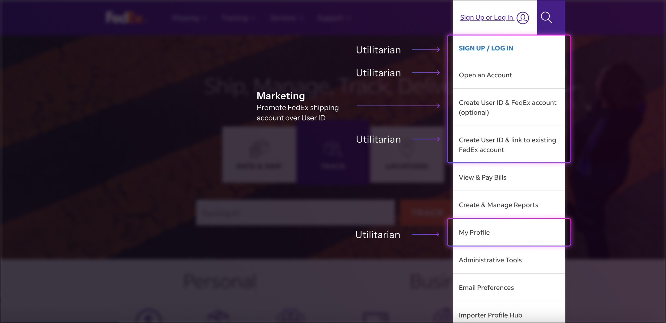
The Sign Up or Log In menu was carrying a mix of objectives:
Confusing terminology forced users to decide without enough context.
Where Users Get Lost
The navigation menu was evaluated against established UX laws to uncover the cognitive and usability barriers impacting users. This analysis revealed how excessive choices, inconsistent patterns, and unfamiliar terminology created friction.
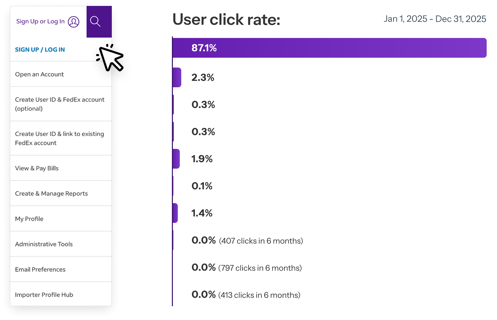
Eleven items, no prioritization, no guidance.
The more choices presented, the longer it takes to decide.

“Sign Up or Log In” appeared twice with no distinction. Users expect consistent patterns across all sites—repetition without purpose creates confusion.

The menu exposed internal terminology users had no framework for. People can only process a limited amount of new information at once.
Finding What Lies Beneath
While the initial request focused on refining navigation terminology and optimizing a specific login page, our investigation uncovered a broader experience challenge.
The pain points were not isolated UI issues, but indicators of deeper experience and system-level challenges spanning multiple stages of the user journey.
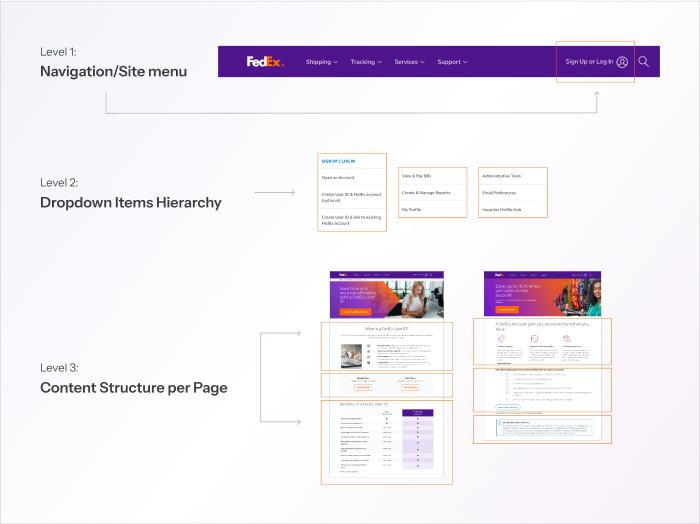
To address the root causes, we expanded the scope beyond individual screens and evaluated the end-to-end experience. Navigation, page hierarchy, and content structure were all contributing to user confusion, requiring a multi-layered approach to create meaningful improvement.
Each layer addressed a different part of the experience:
This approach shifted the focus from fixing surface-level symptoms to uncover the deeper usability barriers impacting every stage of the user journey.
Charting the Path Forward
Taking into consideration the client’s business constraints, operational realities, and the scale of the opportunity, we recommended a phased approach that balanced meaningful experience improvements with minimal disruption to the existing ecosystem.
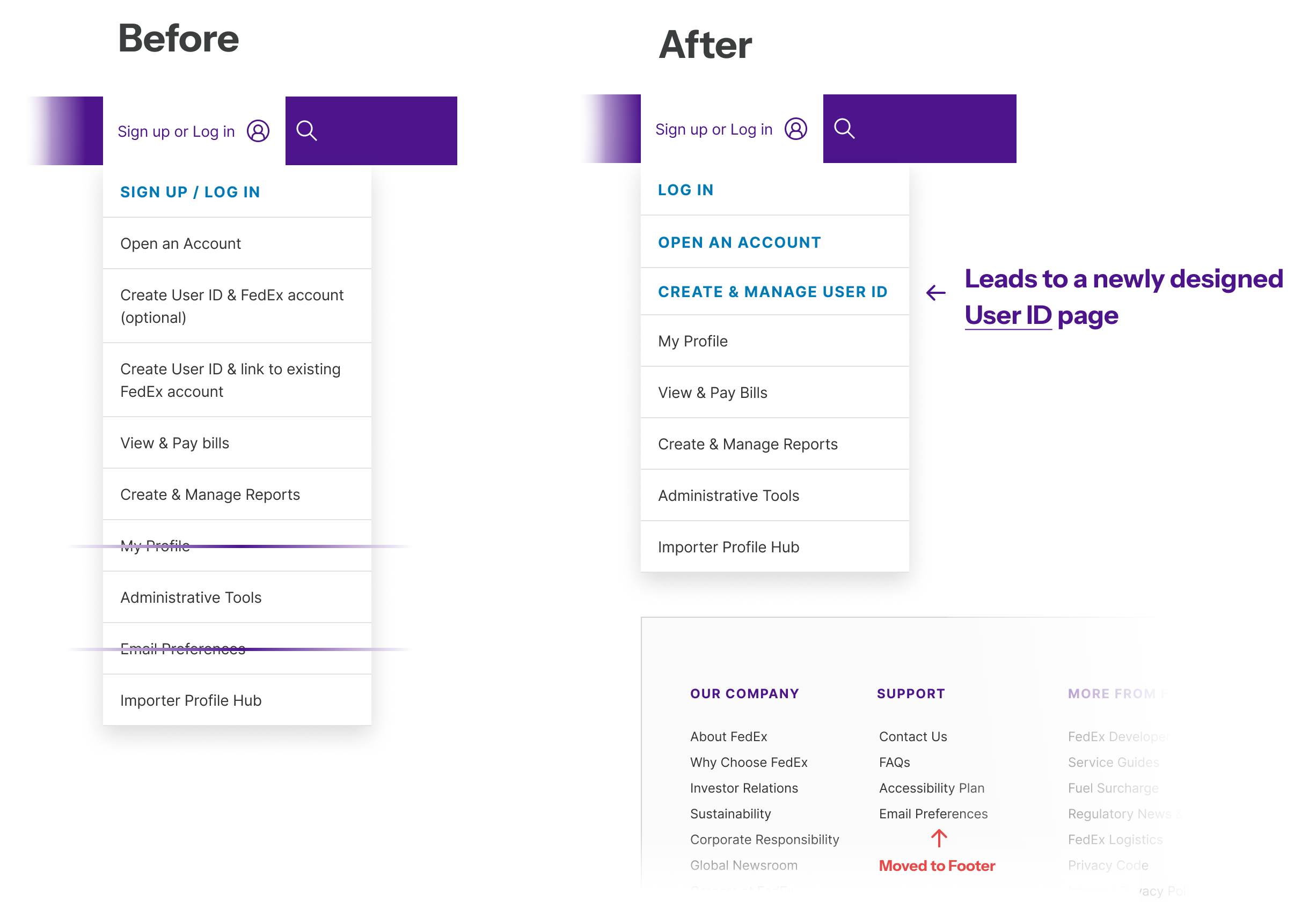
FedEx analytics revealed that nearly 90% of users clicked on the first menu item, indicating that a single option was driving the vast majority of engagement while the remaining items contributed little value and increased cognitive load.
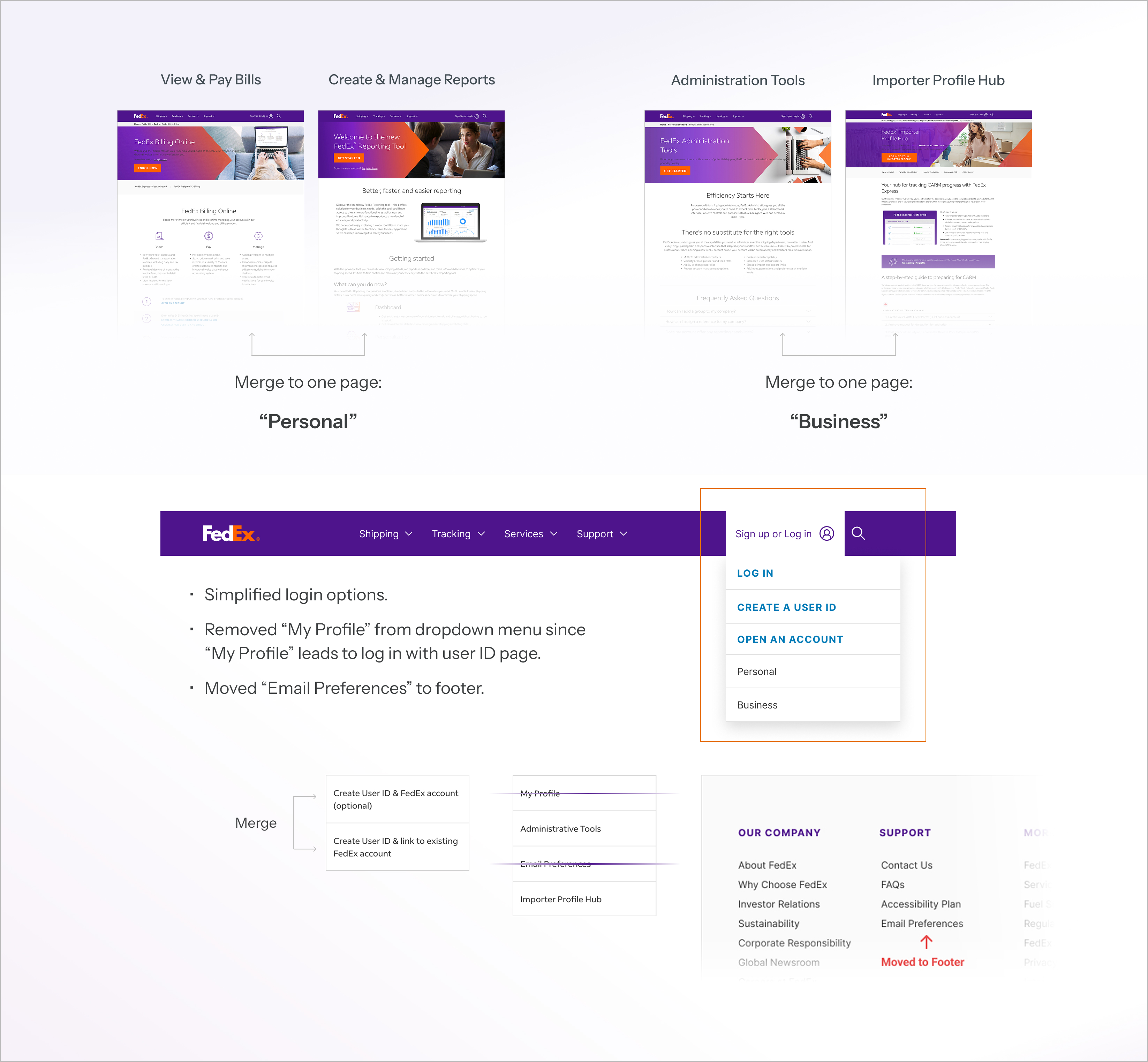
💡 The insight was clear: surface what users need most and remove unnecessary complexity. As a result, we recommended consolidating the navigation from 11 menu items to 5, reducing choice overload and creating a more focused user experience.
Clearer Menu: Merged four pages into two and moved “My Profile” and “Email Preferences” out of the main dropdown to keep the focus on the most important tasks.
Fast Implementation: Improved the user experience using only existing content, requiring no new pages or technical changes.
Global Consistency: Matched the simpler menu styles already used by FedEx in the UK and Asia-Pacific regions.
Stage 2: Refine
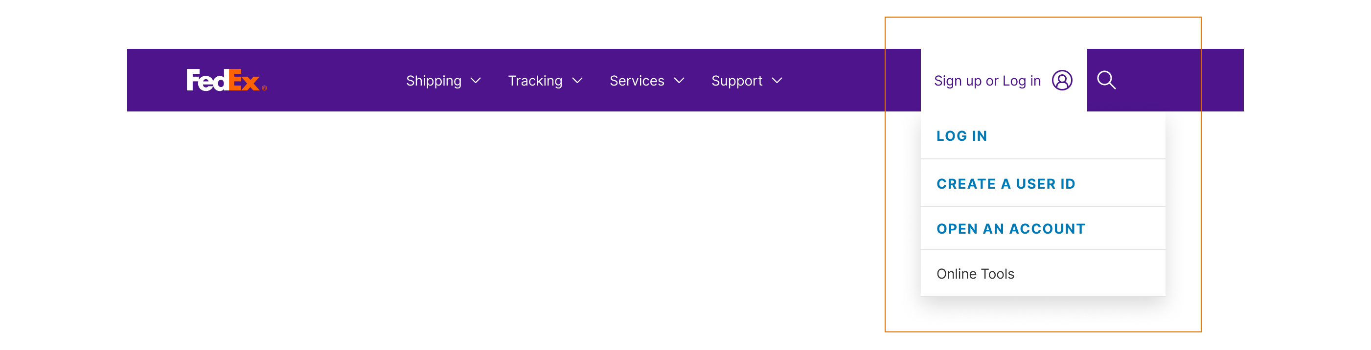
Consolidating utility pages under a single “Online Tools” page to separate tools from account creation, however, “Create a User ID” page and “Open An Account” page stays the same.
Simplified Navigation: Streamlined the primary dropdown into four clear actions: Log In, Create User ID, Open an Account, and Online Tools.
Unified Tool Hub: Consolidated scattered utility pages into a single “Online Tools” destination to separate functional tasks from account creation.
Use-Case Organization: Keep “Personal” and “Business” as tabs in the newly merged “Online Tools” page to stay consistent with existing user’s mental modes from before this change.
Stage 3: Redesign
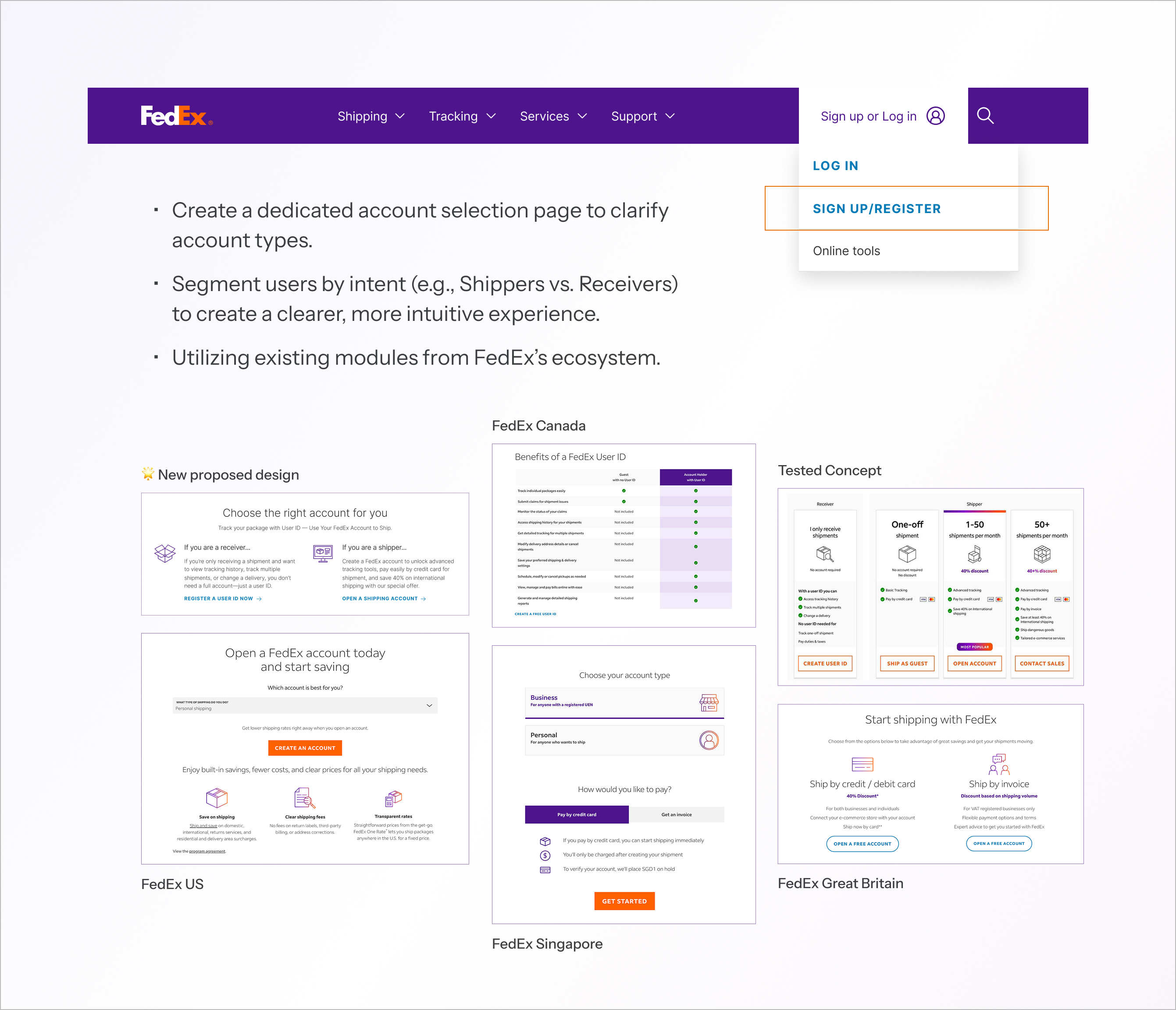
Reframed the account creation experience by replacing multiple entry points with a single “Open an Account” page that guides users based on their needs. This simplified decision-making and reduced unnecessary choices, aligning with Hick’s Law.

Stage 4: Reimagine
Replacing outdated terminology and reducing decision complexity to help users confidently choose the right account path.
FedEx stakeholders have historically been hesitant to move away from the terminology “Open an Account.” However, there is an important distinction between “Open an Account” and “Sign Up.” Within FedEx’s ecosystem, “Open an Account” specifically refers to creating a shipping account that enables users to pay for shipments. Users may interpret this as creating a general online account to access tools, track packages, or manage shipments—actions that may not require a payment account.
This creates a terminology and wayfinding challenge rather than simply a naming preference, as the current label reflects FedEx’s internal definition but does not always align with users’ mental models. As part of a progressive transition, we recommend moving away from legacy terminology and adopting clearer language such as “Sign Up” or “Register” for general account creation.
A dedicated account selection page can then provide additional context around the different account types, helping users understand their options and choose the path that best fits their needs. This experience could further segment users by their primary intent, such as “Shippers” and “Receivers,” creating a clearer and more intuitive onboarding journey.
At a Glance
Segmented User Paths: Divided the signup process into two distinct tracks—Shippers and Receivers—to provide a more tailored experience after users clicks on “Sign up/register”.
Targeted Onboarding: Created a focused flow that helps users identify and open the specific account type that fits their goals.
Dedicated Promotions: Separated the “New Member Welcome Offer” into its own landing page to ensure marketing incentives are clear without cluttering the registration steps.
Competitive Benchmarking: Leveraged global FedEx account pages to identify high-converting design patterns and value propositions.
Strategic Wayfinding: Repositioned the page as a “smart entry point,” using clear hierarchy to direct users toward the account opening flow.
Unified Content: Combined content from the old login and registration pages to make it easier for users to sign up and start shipping.
Starting Small, Thinking Big
FedEx Canada doesn’t own its navigation—FedEx US does. Any structural change requires cross-team approval, so fewer changes mean fewer approvals.
Working with the FedEx Canada team, we focused on low-effort, high-impact improvements that preserved the existing structure while addressing key user pain points.
After several rounds of discussion, we streamlined the navigation and introduced a new User ID landing page that clarifies primary use cases and guides users to the right path before login.

Bringing the Vision Full Circle
The proposed experience creates a path toward a more customer-centered digital ecosystem that benefits both users and the business, directly supporting FedEx’s strategy of increasing self-service adoption and reducing reliance on offline support channels such as phone assistance.